

Watercolor art techniques, a captivating blend of precision and spontaneity, offer a unique path to artistic expression. This guide delves into the foundational and advanced techniques, exploring the nuances of color mixing, paper selection, and compositional strategies. From mastering wet-on-wet washes to achieving realistic light and shadow effects, we’ll navigate the essential elements to elevate your watercolor skills. Whether you’re a beginner seeking a solid foundation or an experienced artist looking to refine your techniques, this exploration promises a deeper understanding of this versatile medium.
We will cover the fundamental techniques, such as wet-on-wet and wet-on-dry approaches, and progressively introduce more advanced methods like lifting, scrubbing, and layering colors. Understanding color theory and its application within a watercolor palette is crucial, as is selecting the appropriate paper and brushes to achieve desired effects. Finally, we’ll examine composition and subject matter, guiding you in creating compelling and visually engaging watercolor paintings.
Basic Watercolor Art Techniques
Watercolor painting, with its luminous transparency and expressive fluidity, offers a unique artistic journey. Mastering basic techniques is crucial to unlocking its full potential. This section explores fundamental approaches, enabling you to confidently navigate the world of watercolor.
Wet-on-Wet and Wet-on-Dry Techniques
The fundamental difference between wet-on-wet and wet-on-dry techniques lies in the moisture content of the paper. Wet-on-wet involves applying wet paint to a previously wet surface, resulting in soft, diffused edges and a blending of colors. This technique is ideal for creating atmospheric effects, soft transitions, and washes. Conversely, wet-on-dry involves applying wet paint to a dry surface, producing sharper, more defined edges and greater control over color placement. This method is better suited for detailed work and precise brushstrokes. The choice between these techniques significantly influences the final appearance of your painting.
Creating a Wash
A wash is a thin, even layer of diluted watercolor paint applied to the paper. To create a wash, mix your desired color with sufficient water to achieve the desired transparency. Start by wetting the area of the paper where you intend to apply the wash. This ensures even absorption and prevents harsh edges. Then, using a large, flat brush, apply the paint smoothly and evenly, working from top to bottom to avoid streaking. Varying the water-to-pigment ratio controls the intensity of the wash. More water results in a lighter, more transparent wash, while less water produces a richer, more saturated color. Multiple washes can be layered to build depth and complexity. Gradual transitions between colors can be achieved by blending wet washes together before they dry.
Controlling Water and Pigment Ratios
The ratio of water to pigment directly impacts the final appearance of your watercolor painting. A high water-to-pigment ratio creates pale, translucent washes, ideal for backgrounds or delicate washes. Conversely, a low water-to-pigment ratio yields intense, opaque colors, perfect for details or bold statements. Experimentation is key to mastering this balance. For example, a high water ratio might be used to create a misty sky, while a low ratio would be employed to paint vibrant flowers. Remember that the absorbency of your paper will also influence the final effect.
Basic Brushstrokes
Various brushstrokes contribute significantly to the overall texture and expression of a watercolor painting. Simple strokes, such as flat washes, create even color fields. Circular strokes can be used to render soft, organic forms. Hatching, achieved by applying a series of parallel lines, adds texture and direction. Scumbling, a dry-brush technique involving light, broken strokes, creates a textured, granular effect. These basic brushstrokes form the foundation for more complex techniques and allow for a range of expressive possibilities. Consider the effect of varying pressure and speed on the brush to further diversify your strokes.
Brush Types and Their Suitability
A variety of brushes cater to different watercolor techniques. The appropriate brush selection enhances control and facilitates desired effects.
| Brush Type | Characteristics | Suitable Techniques | Example Application |
|---|---|---|---|
| Round Brush | Pointed tip for detail; versatile | Wet-on-dry, fine details, lines | Painting delicate petals or fine branches |
| Flat Brush | Broad, flat tip for washes and even coverage | Wet-on-wet washes, broad strokes | Creating skies or large background areas |
| Fan Brush | Splayed bristles for textured effects | Creating foliage, textured backgrounds | Painting grass or tree leaves |
| Round Mop Brush | Large, soft bristles for large washes | Wet-on-wet washes, large areas of color | Creating atmospheric backgrounds |
Advanced Watercolor Techniques
Having mastered the basics, let’s delve into more nuanced techniques that elevate your watercolor painting to a higher level of artistry. These advanced methods allow for greater control, expressive freedom, and the creation of stunningly realistic effects.
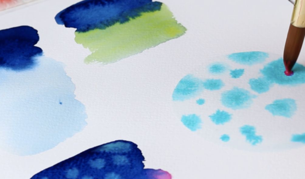
Lifting, Scrubbing, and Blotting
These three techniques offer subtle yet powerful ways to manipulate wet paint. Lifting involves gently removing wet pigment using a clean, damp brush or absorbent paper, revealing the white of the paper or underlying layers. This is ideal for creating soft edges, highlights, or subtle gradations. Scrubbing, in contrast, uses a more vigorous back-and-forth motion with a damp brush to lift and blend colors, creating textural effects and a sense of movement. Blotting, often done with a paper towel or soft cloth, absorbs excess water and pigment, creating interesting textures and variations in color intensity. The pressure applied and the dampness of the brush or absorbent material determine the degree of pigment removal or textural change. For instance, a light touch with a damp brush will result in a delicate lift, while a firm scrub will remove more pigment.
Masking Fluid and Highlight Preservation
Masking fluid is a liquid latex-based substance that creates a waterproof barrier on the paper, preventing paint from adhering to those areas. This is invaluable for preserving highlights, intricate details, or areas you wish to keep bright and clean. Apply masking fluid using a brush or a specialized masking pen, ensuring an even coat. Allow it to dry completely before painting. Once the painting is complete, gently peel or rub off the dried masking fluid to reveal the pristine, unpainted areas beneath. For example, masking fluid is extremely helpful when painting delicate flowers; applying it to the petals before painting the background ensures the highlights on the petals remain sharp and bright.
Creating Texture in Watercolor Paintings
Various methods can create texture. Salt sprinkled onto wet paint creates a unique granular effect as the salt absorbs the water and leaves behind textured patterns. Using textured paper adds inherent texture to the painting. Applying paint heavily and allowing it to dry naturally can also create interesting textural variations. Finally, layering different colors and techniques can add depth and a sense of three-dimensionality, contributing to the overall textural experience. The texture created by salt, for instance, is unpredictable and organic, unlike the smoother texture created by using smooth watercolor paper.
Layering Colors in Watercolor: A Step-by-Step Guide
Layering colors is crucial for achieving depth and richness. Begin with lighter washes of the base colors, allowing each layer to dry completely before applying the next. Work from light to dark, gradually building up the intensity and complexity of the colors. Use transparent washes for delicate layering and opaque washes for bolder effects. This controlled layering process helps create depth and luminosity. For instance, layering a pale yellow wash followed by a translucent orange wash will create a vibrant, luminous effect.
Creating Realistic Effects: Light and Shadow
Realistic effects are achieved through careful observation and the skillful manipulation of light and shadow. Observe the way light falls on your subject, noting the highlights, mid-tones, and shadows. Use lighter washes for highlights, gradually increasing the intensity of color and value in the mid-tones and shadows. Soft edges create a sense of diffused light, while sharper edges define form and create contrast. For example, depicting a sphere requires a careful gradation of color from a bright highlight to a darker shadow, with soft transitions between them to create a three-dimensional effect.
Color Mixing and Palette Design
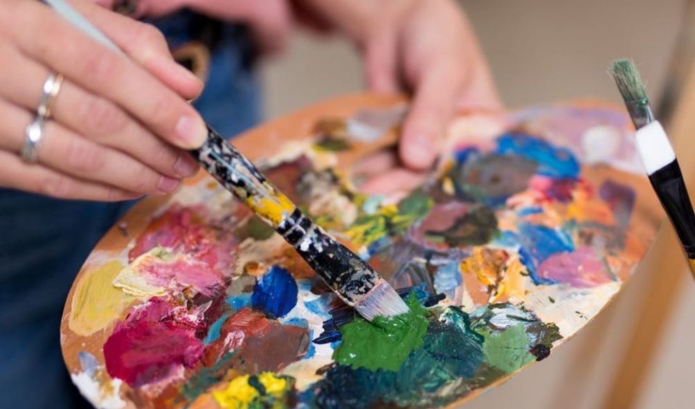
Understanding color mixing and palette design is crucial for achieving the desired effects in watercolor painting. A well-chosen palette allows for a wide range of hues and tones, while effective mixing techniques enable the artist to create subtle gradations and vibrant colors. This section explores the principles of color theory and their application in watercolor painting.
The Color Wheel and its Relevance to Watercolor Mixing
The color wheel is a visual representation of the relationships between colors. It’s based on the primary colors (red, yellow, blue), which cannot be created by mixing other colors. Secondary colors (green, orange, violet) are created by mixing two primary colors. Tertiary colors are formed by mixing a primary and a secondary color. Understanding the color wheel helps predict the results of mixing colors. For instance, mixing red and yellow creates orange; mixing blue and yellow creates green; and mixing red and blue creates violet. The wheel also illustrates complementary colors (colors opposite each other on the wheel), analogous colors (colors next to each other), and triadic colors (three colors evenly spaced on the wheel). These relationships are fundamental to creating harmonious and visually appealing color schemes in watercolor paintings.
Creating Various Hues and Tones Using Limited Color Palettes
Working with a limited palette encourages experimentation and develops a deeper understanding of color mixing. For example, a palette consisting of only Ultramarine Blue, Cadmium Yellow, and Alizarin Crimson can produce a surprisingly wide range of colors. Mixing the three primaries directly will yield the secondary colors. Adding small amounts of one color to another will create a vast array of hues. Varying the water-to-pigment ratio allows for adjustments in tone, from light washes to intense, saturated colors. For example, a pale yellow can be achieved by mixing a small amount of Cadmium Yellow with a large amount of water; a deep, saturated yellow is achieved by using more pigment and less water. This principle applies to all colors in the palette, allowing the artist to create depth and complexity using just three pigments.
Mixing Warm and Cool Colors in Watercolor
Warm colors (reds, oranges, yellows) evoke feelings of warmth and energy, while cool colors (blues, greens, purples) suggest calmness and serenity. The temperature of a color can be adjusted by adding small amounts of its complement. For instance, adding a touch of blue to orange will cool it down, shifting it towards a more reddish-orange. Conversely, adding a touch of yellow to green will warm it, creating a more yellowish-green. Mastering the art of adjusting color temperature allows for subtle nuances in a painting, adding depth and sophistication. For example, a landscape might use warmer colors for the foreground and cooler colors for the background to create a sense of depth and perspective.
Complementary, Analogous, and Triadic Color Schemes
Complementary color schemes, using colors opposite each other on the color wheel (e.g., red and green, blue and orange), create high contrast and vibrancy. Analogous color schemes, using colors adjacent to each other (e.g., blue, blue-green, green), create a sense of harmony and tranquility. Triadic color schemes, using three colors evenly spaced on the wheel (e.g., red, yellow, blue), offer a balanced and visually interesting combination. The choice of color scheme depends on the desired mood and effect of the artwork. For example, a vibrant still life might benefit from a complementary scheme, while a peaceful landscape might be better suited to an analogous scheme.
A Balanced Watercolor Palette
Imagine a palette containing: Cadmium Yellow Light (a warm, bright yellow), Aureolin (a cool, lemon yellow), Alizarin Crimson (a cool, slightly bluish red), Cadmium Red Light (a warm, bright red), Ultramarine Blue (a cool, deep blue), Cerulean Blue (a bright, slightly greenish blue), Phthalo Green (a cool, intense green), Burnt Sienna (a warm, earthy brown), and Ivory Black (a cool, neutral black). This arrangement provides a range of warm and cool colors, covering the spectrum from bright and intense to muted and earthy tones. The inclusion of both warm and cool variations of primary and secondary colors allows for subtle adjustments and a wide range of mixing possibilities. The addition of brown and black provides depth and contrast.
Watercolor Paper and Materials
Selecting the right paper and materials is crucial for achieving the desired effects in watercolor painting. The quality of your materials directly impacts the vibrancy of your colors, the texture of your washes, and the overall longevity of your artwork. Understanding the properties of different papers and paints will significantly enhance your painting experience.
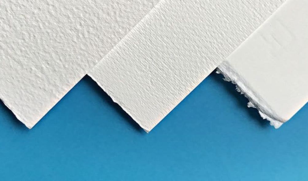
Watercolor Paper Types and Characteristics
Watercolor paper is available in a wide range of weights, textures, and surface types. The weight, measured in pounds (lbs) or grams per square meter (gsm), indicates the paper’s thickness and its ability to withstand multiple layers of washes without buckling or warping. Heavier weight papers (300gsm and above) are generally preferred for detailed work and layering. Texture, often described as “hot-pressed,” “cold-pressed,” or “rough,” affects how the paint flows and dries. Hot-pressed paper has a smooth surface, ideal for fine details and precise lines. Cold-pressed paper offers a slightly textured surface, suitable for a variety of techniques. Rough paper, with its pronounced texture, is best for expressive washes and dramatic effects. The choice of paper depends largely on the intended painting style and level of detail.
Paper Selection for Specific Techniques
The appropriate paper choice is directly linked to the painting technique. For example, delicate washes and fine details benefit from the smooth surface of hot-pressed paper, minimizing the absorption of the paint and allowing for sharp edges. Conversely, techniques involving bold, expressive washes and textured effects are better suited to rough or cold-pressed paper, which allows for greater absorption and diffusion of the pigment. The absorbent nature of cold-pressed paper allows for layering and blending techniques.
Watercolor Brush Types and Uses
Watercolor brushes come in a variety of shapes, sizes, and hair types. Round brushes are versatile, suitable for both detail work and broad strokes. Flat brushes are excellent for creating washes and bold lines. The hair type significantly influences the brush’s performance. Sable brushes, known for their fine point and excellent water retention, are favored for detailed work, although they are more expensive. Synthetic brushes offer a more affordable alternative, providing a good balance of performance and cost-effectiveness. A variety of brushes, including both round and flat shapes in various sizes, is recommended for a complete range of techniques.
Watercolor Paint Properties: Student Grade vs. Professional Grade
Student-grade paints typically contain a higher proportion of fillers and less pigment compared to professional-grade paints. This results in less vibrant colors and a potentially less durable finished product. Professional-grade paints, on the other hand, boast a higher pigment concentration, resulting in richer, more luminous colors and greater lightfastness (resistance to fading over time). While student-grade paints are suitable for beginners and practice, professional-grade paints are preferred for serious work and archival quality.
Essential Watercolor Materials for Beginners
Beginners should focus on acquiring a basic set of materials to avoid unnecessary expense and complexity. A well-rounded starter kit should include:
- Watercolor paper (cold-pressed, 300gsm): A block or pad of cold-pressed paper provides a convenient and stable surface for painting.
- Watercolor paints (student-grade): A set of 12-24 basic colors will suffice for initial exploration.
- Round and flat watercolor brushes (synthetic): A selection of sizes, such as a small round brush for details and a larger flat brush for washes, is recommended.
- Palette: A plastic palette or a ceramic tile works well for mixing colors.
- Water containers: At least two containers are needed, one for clean water and one for rinsing brushes.
- Paper towels or rags: For cleaning brushes and blotting excess water.
- Masking fluid (optional): For reserving areas of white paper.
- Pencil and eraser: For sketching the composition before painting.
Composition and Subject Matter
Successful watercolor painting hinges not only on technical skill but also on thoughtful composition and subject selection. A well-composed painting draws the viewer’s eye, creating a sense of harmony and visual interest. The choice of subject matter, in turn, dictates the overall mood and message of the artwork.
Compositional principles guide the arrangement of elements within a painting to achieve a desired effect. Understanding these principles allows artists to create balanced, dynamic, and visually appealing works. Subject selection, meanwhile, involves considering the inherent qualities of the chosen subject and how those qualities can be effectively translated into the watercolor medium.
Principles of Composition
The rule of thirds, a fundamental principle in composition, suggests placing key elements off-center, approximately one-third of the way from the edges of the painting. This creates a more visually engaging composition than centering the subject. Leading lines, such as roads, rivers, or fences, can guide the viewer’s eye through the painting, creating a sense of depth and movement. Other compositional techniques include using shapes and forms to create visual weight and balance, employing negative space effectively, and considering the overall flow and rhythm of the elements within the painting. For instance, a landscape painting might use a winding river as a leading line to draw the viewer’s gaze towards a distant mountain range, strategically placed according to the rule of thirds.
Abstract versus Realistic Approaches to Composition
Abstract watercolor paintings prioritize the expression of color, texture, and form, often disregarding realistic representation. The composition might focus on the interplay of colors and shapes, creating a sense of energy or emotion. Realistic watercolor paintings, conversely, aim for accurate depiction of the subject matter, employing techniques like perspective and light to create a sense of three-dimensionality. A realistic still life, for example, might meticulously render the details of fruit and flowers, while an abstract piece might simply explore the interaction of blues and greens in a non-representational way.
Designing a Composition Using Simple Shapes
Let’s consider a simple composition featuring a sun, a house, and a tree. The sun could be represented by a large yellow circle positioned slightly off-center, adhering to the rule of thirds. A simple square or rectangle could represent the house, placed below and slightly to the side of the sun. A triangular shape could depict the tree, positioned near the house but not overlapping it significantly. This arrangement creates a balanced composition, with the sun as the dominant element, the house providing stability, and the tree adding a touch of organic form. The use of negative space—the empty areas around the shapes—further enhances the overall effect, allowing the eye to rest and appreciate the individual elements.
Choosing and Preparing Subjects for Watercolor Paintings
Subject selection involves considering the inherent qualities of the subject and its suitability for the watercolor medium. Watercolor excels at capturing delicate details and subtle gradations of light and color. Therefore, subjects with intricate textures, such as flowers or foliage, or those with translucent qualities, such as water or glass, are particularly well-suited. Preparing the subject might involve sketching preliminary compositions, studying the light and shadow, and gathering reference materials, such as photographs or sketches. Careful observation is crucial to accurately capturing the essence of the subject and translating it onto the watercolor paper.
Creating Depth and Perspective in Watercolor Paintings
Depth and perspective can be achieved through various techniques. Atmospheric perspective involves creating a sense of distance by gradually reducing the intensity of colors and detail in the background. Linear perspective uses converging lines to create the illusion of depth, while overlapping objects can also suggest depth and spatial relationships. For example, in a landscape, the mountains in the distance would appear lighter and less detailed than the foreground elements, while roads or rivers might converge towards a vanishing point to create linear perspective. Overlapping trees and shrubs would further reinforce the sense of depth and spatial arrangement.
Final Thoughts
Mastering watercolor art techniques is a journey of continuous learning and experimentation. This guide has provided a structured approach to understanding the core principles and diverse applications of this beautiful medium. By combining a solid understanding of the fundamental techniques with creative exploration, you can unlock your potential and create stunning works of art. Remember to embrace the unexpected, experiment with different approaches, and most importantly, enjoy the process of creating your own unique watercolor masterpieces.
Read More:
- Famous Artists Paintings: A Concise Overview
- Black Artist Paintings: A Best Visual History
- Passive Income for Artists: Unlocking Financial Freedom